Cocoon yourself in deep, rich tones, practice mindfulness with new and optimistic neutrals, and reimagine what home really means to you. Industry experts predict that 2021 will be all about using color to reconnect to the places and themes that matter most.
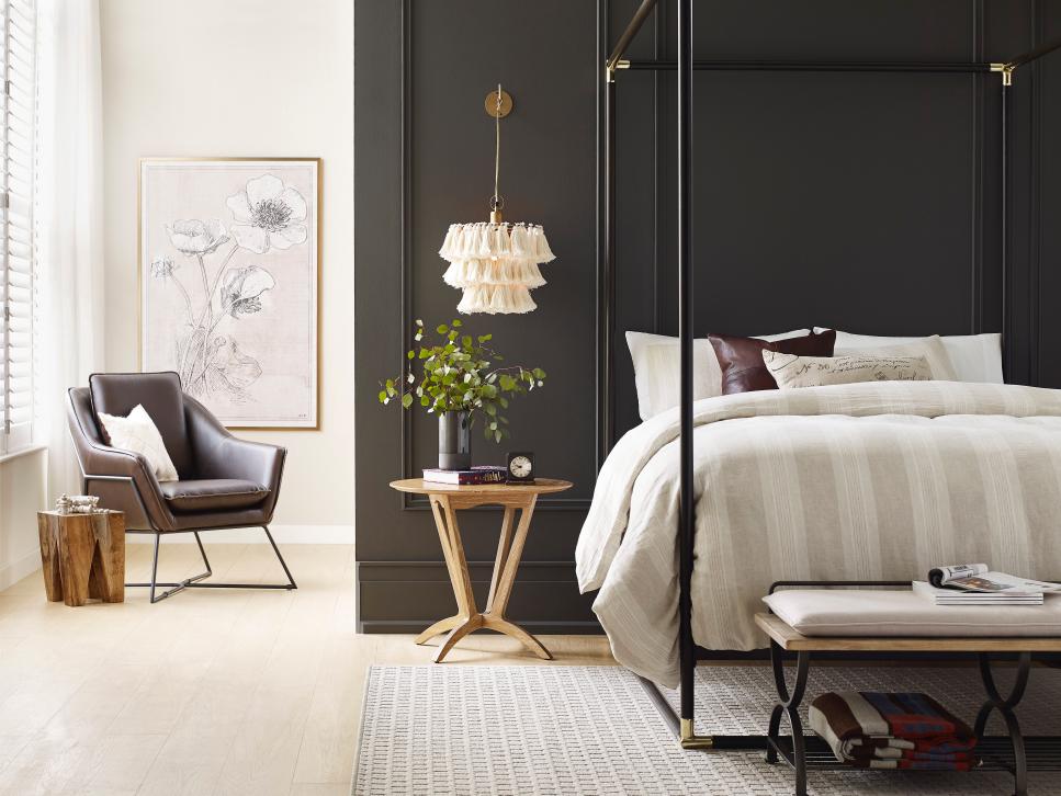
Sherwin-Williams’ Urbane Bronze
In 2020, the buttoned-up, Gilded-Age drama of Navy (SW 6244) splashed across interiors like star-studded tracts of the night sky. That celestial celebration gives way to something more grounded in 2021: Urbane Bronze (SW 7048), which draws on the comforts of home by cultivating a familiar contemporary retreat from the outside world. “Urbane Bronze encourages you to create a sanctuary space for mindful reflection and renewal,” says Sue Wadden, director of color marketing at Sherwin-Williams. “There’s also reassurance in its sentimentality, with nostalgic ties to the design of the ‘70s and ‘90s, but with gray undertones that give it a distinctly modern twist.”
“Complement the simplicity of Urbane Bronze with natural materials — like wood finishes, organic stone accents or woven textiles — and a variety of mixed metals to create a serene space grounded in nature,” Sue recommends. The color’s anchoring quality makes it a new-neutral powerhouse that serves well in spaces like living rooms and dens, as well as sanctuaries like bedrooms and home offices. To find complementary tones and inspiration, explore the Sanctuary palette from Sherwin-Williams’ 2021 Colormix Forecast: “The ‘stay at home’ mantra has directed where we go and what we do in 2020, but it will also influence interior design trends for 2021 and beyond,” Sue predicts.
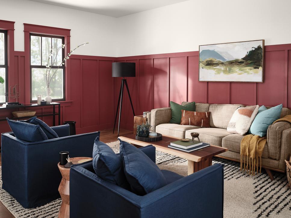
HGTV Home by Sherwin-Williams’ Passionate
Developing a new relationship with one’s home, as so many of us have done this year, involves reimagining what comfort and tradition really mean. Passionate (HGSW 2032) — the anchoring hue of HGTV by Sherwin-Williams’s 2021 Delightfully Daring Color Collection — is a bold take on an old favorite, evoking the simple, classic pleasures of watching the seasons change and sipping a glass of red wine. This rich color can headline a space all by itself or background a collection of beloved artwork and objects — and as one would expect, it brings out the best in the other nine emotional, elemental tones it introduces.
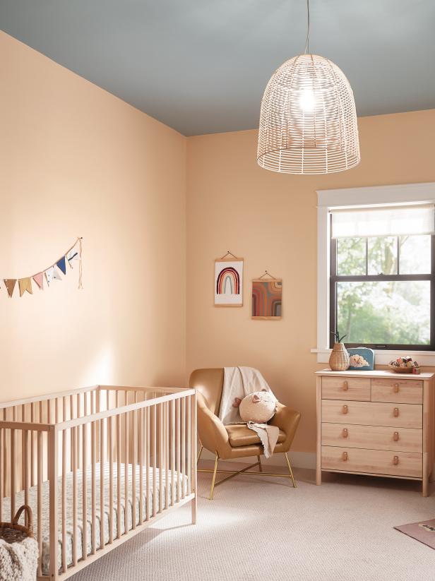
HGTV Home by Sherwin-Williams’ Pale Apricot
Get ready for the next generation of blush in the Delightfully Daring Color Collection: Pale Apricot (HGSW 1126) takes the delicate warmth that makes barely-there pink so appealing and gives it a toasty orange undertone. This color echoes organic tones like minimally finished hardwood, buttery leather and even unbleached cotton, and it just loves to be swathed in natural light in nurseries and bedrooms. Like a few dashes of bitters in an Old Fashioned, it balances sweetness with just a tad of sophistication. See the full HGTV Home by Sherwin-Williams 2021 collection below.
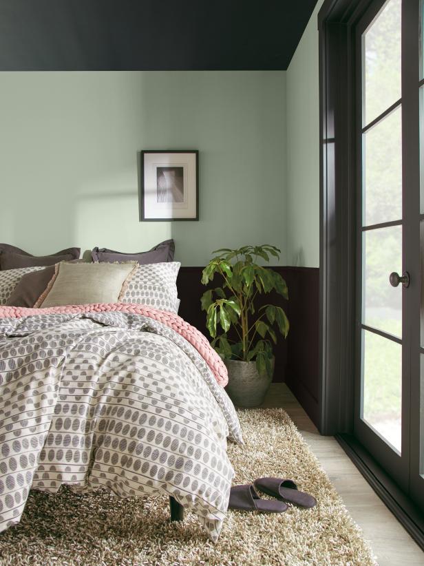
Behr’s Jojoba and Broadway
Behr celebrated the rejuvenation associated with wide-open spaces and the natural world with Back to Nature (S340-4). That garden-inspired hue that dissolved the boundaries between our outdoor and indoor lives gives way to a Color Trends 2021 Palette that explores “Elevated Comfort” through six color themes: Casual Comfort, Optimistic View, Subtle Focus, Calm Zone, Quiet Haven and Outdoor Escape. Calm, restorative Jojoba (N390-3) offers a misty-morning alternative to the golden-hour note supporting last year’s pick; by contrast, it evokes the feel of gazing through a bedroom window at a coastline shrouded in fog. It comes alive with darker and bolder tones like Broadway (PPU18-20), a deep and dusty hint of aubergine that complements shades of green and maximalist design choices. (It’s also a rather spectacular choice on a ceiling, no?)
Behr’s Kalahari Sunset and Almond Wisp
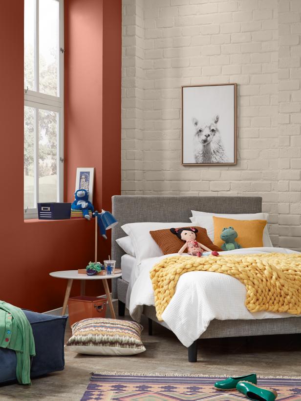
The Casual Comfort color theme offers crowd-pleasers like Almond Wisp (PPU5-12), a warm-toned and unpretentious neutral that softens textured surfaces like exposed brick and offers dimensionality to pale, contemporary farmhouse-inspired spaces. Eclectic tones in the Optimistic View theme — like Kalahari Sunset (MQ1-25), a ferrous orange that evokes the majesty of day’s end on a sandy savannah — put a sophisticated and even luxurious spin on primary tones. There’s that ‘elevated’ comfort: “This has been a year of unpredictability and 2020 has significantly changed out relationship with our home,” says Erika Woelfel, vice president of color at Behr. “A new, ‘elevated’ articulation of ‘comfort’ goes beyond traditional beige, gray and green hues, and embraces color in a way that can redefine and enhance any type of space inside or outside the home.”
2021 is looking to be quite the colorful year! Find the rest of the color trends for the new year here.
Courtesy of HGTV


