
If you’ve ever painted a room, you’ve probably experienced a common mishap: A color you picked based on a swatch or paint chip looks drastically different once it’s on your wall. After all, you’re taking a color from a small, handheld cardstock square and applying it across a very large surface. And unless your room is illuminated by the same commercial-grade fluorescent fixtures that brighten home center paint aisles, you’re also changing the light that will affect the color.
Paint swatches can be overwhelming when you’re facing a giant selection at the store. But there is a foolproof process that ensures the color you achieve on your walls is exactly what you are hoping for. Here are our expert, no-fail tricks to pick the perfect paint color using swatches or paint chips.
1. Select Multiple Paint Colors from Swatches
The important first step in choosing a paint color is getting it out of the store’s paint aisle. Choose a handful of hues, or borrow the entire fan deck of colors, and bring the chips home. Keep an open mind; you never know which one will end up as your final pick.
Look at them in the room you want to paint at all times of day, from bright morning light to golden afternoon light to lamp-lit darkness. Hold them against existing upholstery fabrics, wall art (like this Better Homes & Gardens Forest Sunset Framed Wall Art, $33, Walmart), lampshades, and curtains. You might consider highlighting a color from a throw pillow or drapes to tie the room together. Narrow your choices to two or three colors. Chips that show coordinating colors are especially helpful. They suggest what shade of blue would look good with your walnut dining table and ecru curtains.
On a paint strip, all of the colors are variations of the same formula. They share the same undertones but have different intensities. The very bottom color will give you the best idea of the undertone and color family. Be cautious of comparing two swatches next to one another. They might look similar on paper but reveal their true hue when standing alone. If you do want to compare similar colors, opt to test a larger section of both on the wall.
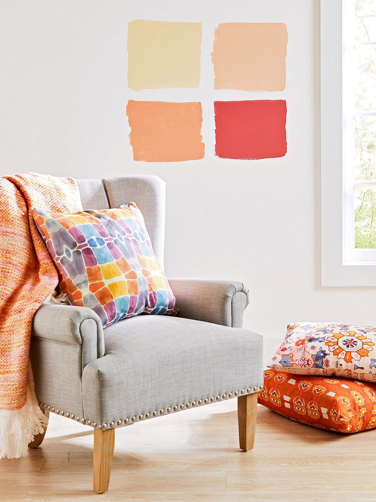
2. Test Paint Colors on Your Wall
Back in the paint aisle, ask for sample amounts of your favorite colors. Most companies offer small containers, which might cost a few dollars. If you’re considering several paint colors, this can add up, but it’s a worthy investment. Nothing will help you choose a color better than seeing the hue applied to the wall.
Take the samples home and brush them on the walls of your room. Paint broad sections of the wall at eye level. The larger the section the better to evaluate the color, so don’t be shy. You’ll be able to paint over these test plots, even if they are dark shades and you need a primer.
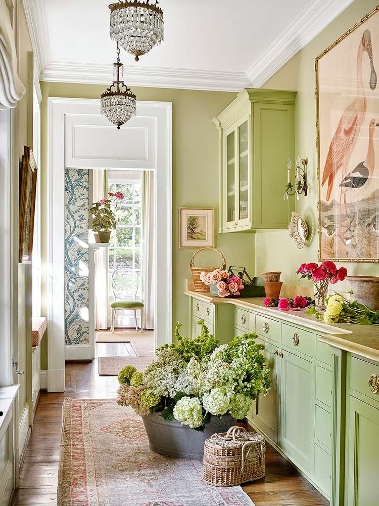
Once the test sections are dry, hang artwork over them, push furniture in front of them, and stand back in the room to see how they look. Live with these splashes on the wall for a little while to see how they look on different days. A buttery yellow might prove to be brighter than you want on sunny days, or a sage green (like Better Homes & Gardens Paint and Primer in Laurel Leaf, $34, Walmart) might turn drab and disappointing on overcast days. How the colors look at night in the glow of your lamps is also something to test.
Editor’s Tip: Once you decide which color to go with, you’ll want to lightly sand the dried sample paint section. This will help minimize the extra layer of paint on that portion of the wall when you paint over it.
3. Ask a Paint Expert for Sheen Recommendations
Once you’ve settled on the winning color, consult the experts at your local paint store about what sheen to choose. Based on what wall surface you have—whether drywall, plaster, or paneling—and whether the walls will need to be protected from moisture (in a bathroom or kitchen) or fingerprints (along a hallway or stairwell), they’ll suggest the best paint sheen to achieve the color you want. For example, flat-sheen paint gives you color closest to the original paint chip, whereas semigloss paint will have a moderate reflective quality that will dampen the vibrancy of the color slightly.
Now that you’ve done your homework, all that’s left to do is paint your walls!
Courtesy of Better Homes & Gardens